Design Influences (part 3)
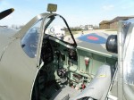
The instrument panel of the Supermarine Spitfire HF Mk IXe at the 2010 Andrews AFB open house. Source, Flickr user Mr. T in DC
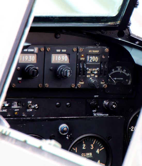 Spitfire HF Mk IXe Cockpit
The third in the trio of posts showing the design infuences of the Atomic Duck. This week focusing on the interior styling and canopy.
Interiors
Velomobiles are simple machines (especially when compared to cars!) so they need very few controls. For the interior, its important that this simplicity does not make it look sparse; and having the controls well placed, so they are intuitive to use.
For simple, well placed interiors, early planes and cars are a good source. With fewer instruments, the dashboard/cockpit layout is much more simple than in more modern examples.
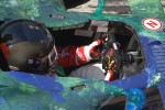
As an example a highly focussed driving environment, modern Fomula 1 cars have every control on and around the steering wheel; so all the settings for the car can be changed without the driver looking away from the road for any longer than necessary. Having all the controls on the steering wheel is only possible because the wheel can only rotate about 200 degrees (just over half a turn); so the driver’s hands never have to move from one position; and the displays are normally the right way up.
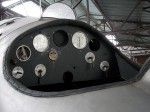 Albatros H-1
 Bristol Fighter cockpit
 Spitfire Cockpit
 Racing Car On Angel Hill
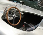 300SLR cockpit_3233c
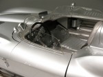 Sting Ray cockpit_3296
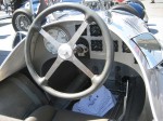 Cockpit, Auto Union GP Racer
 Lotus F1 Cockpit
Canopy
Providing protection from the elements for a rider presents a set of challenges similar to the body (see the Aerodynamic Efficiency post) where compound curved shapes are most efficient, but also the most difficult to produce–meaning most expensive. The problem is made more difficult because the bi-directional curvature can cause the transparent surface to “lens” (a thickness changes across the area) leading to optical distortion when looking through the canopy.
If you look closely at modern car windscreens, you’ll see that they have most of their curvature in one direction only; either across the width or up the height of the screen. If they have any curvature at all in the other direction, that radius will be extremely large. The illusion that windscreens seem more curved than they actually are, is caused by the shape of the panels that surround them.
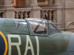
Many engineers and designers have had to design around these problems, with solutions that typically involve joining simply shaped panels to make a more complex shape like the examples below.
 Aviation Museum, Dumfries, June 08
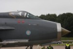 English Electric Lightning Cockpit
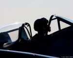 Spitfire Pilot
That’s it for these posts explaining where the design for the Atomic Duck has come from. Next week is the result– What will the Atomic Duck Look Like?
allan wrote, “"its important that this simplicity does not make it look sparse;" Size. The size of the velomobile is so small that it will not look sparse inside. This is a benefit, actually. The smaller the cross-sectional area, the more easily the velomobile will slip through the air.”